STAR & LEAF WORK
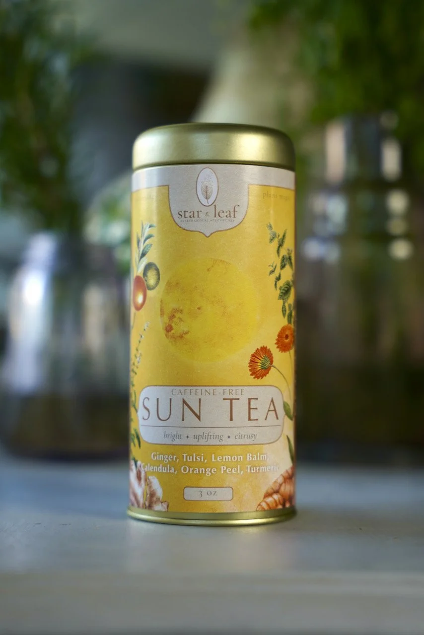
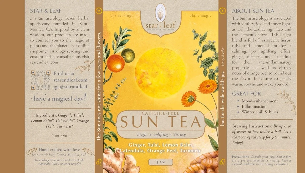
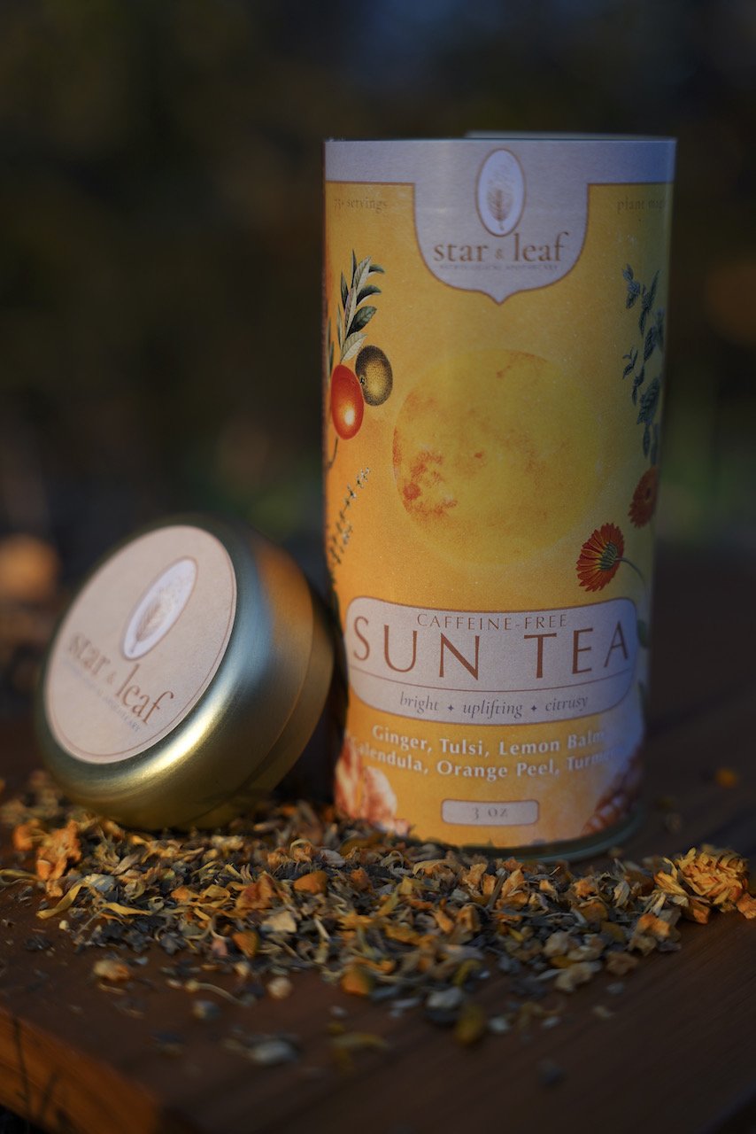
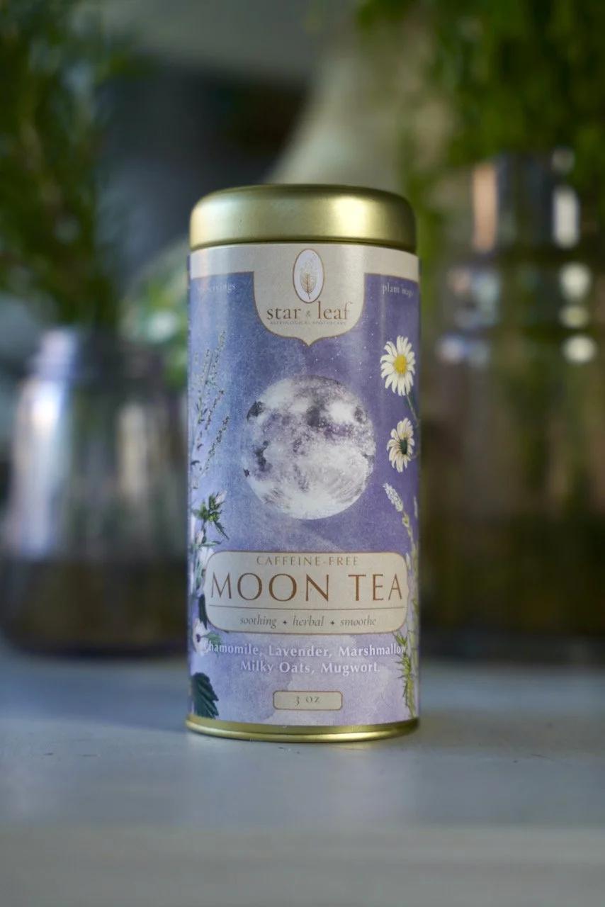
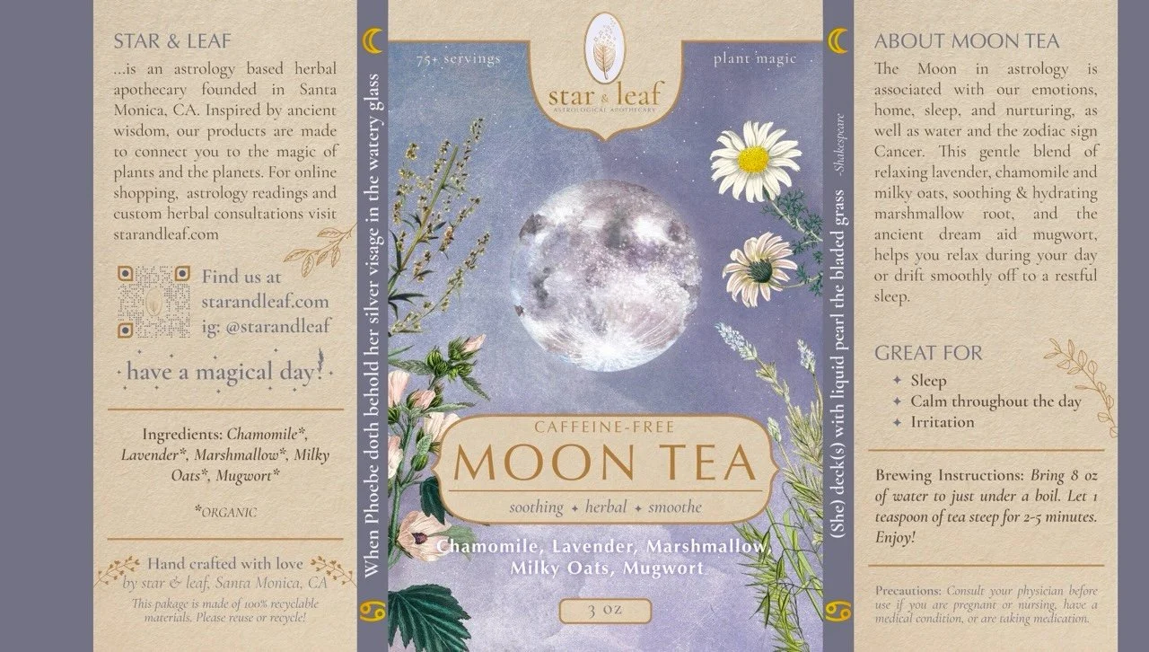
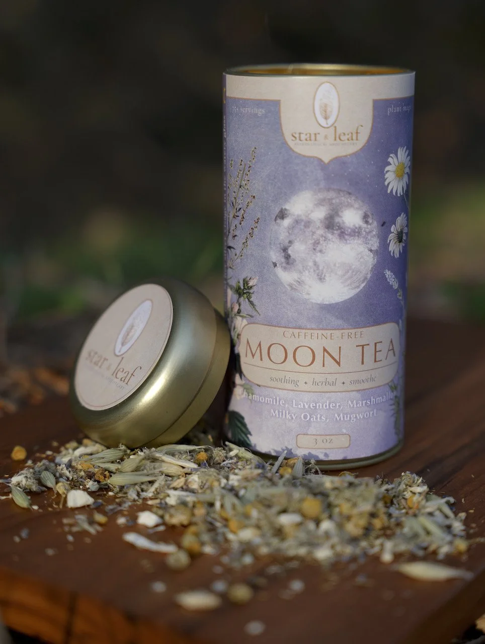
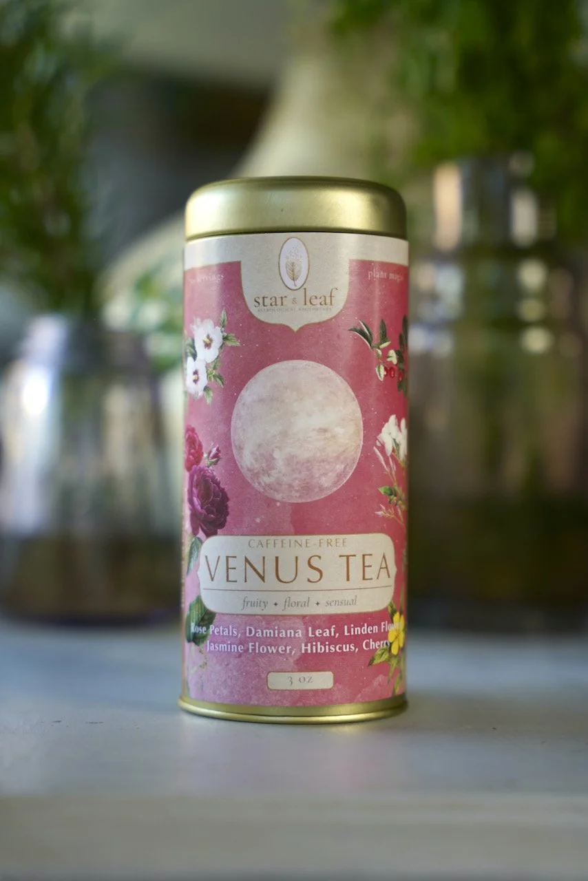
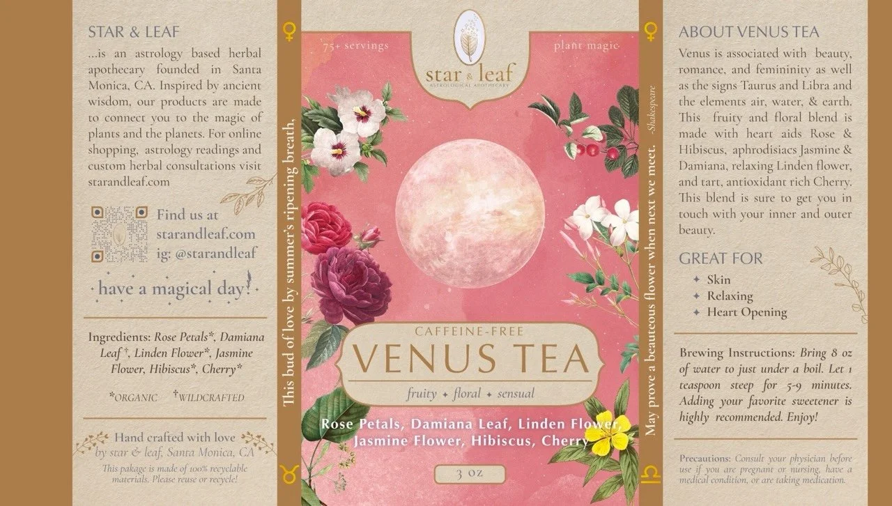
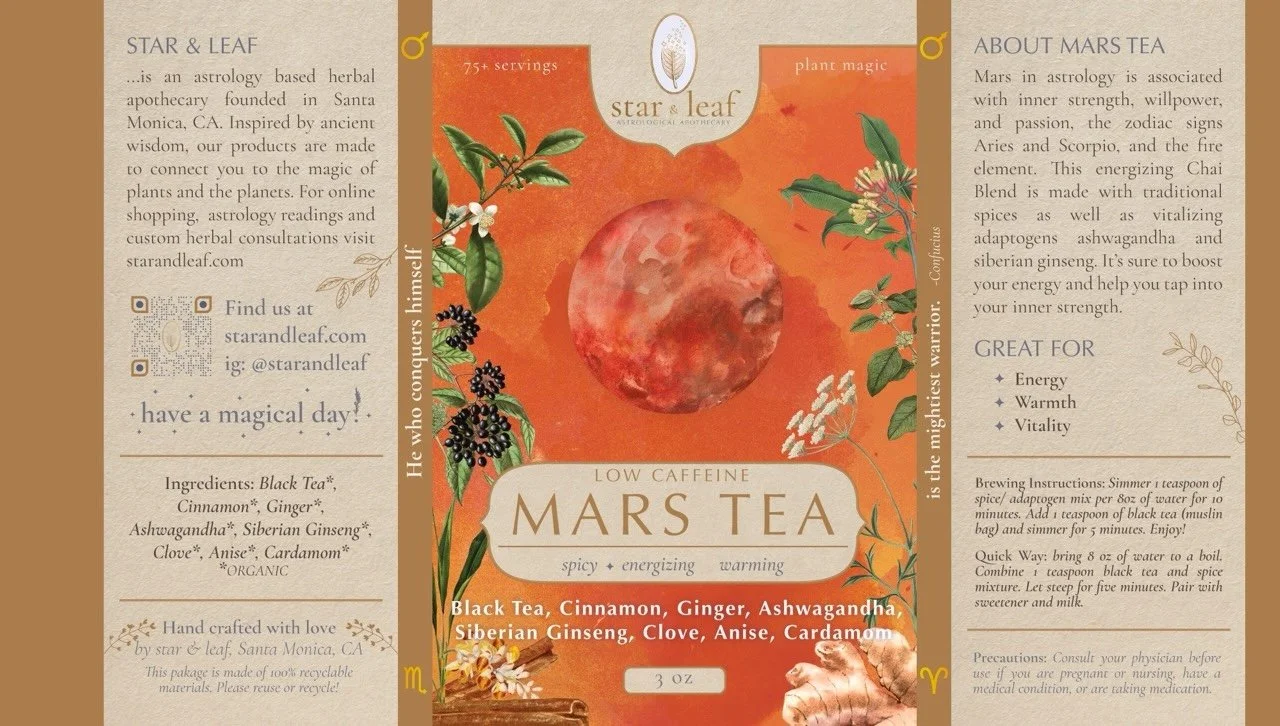
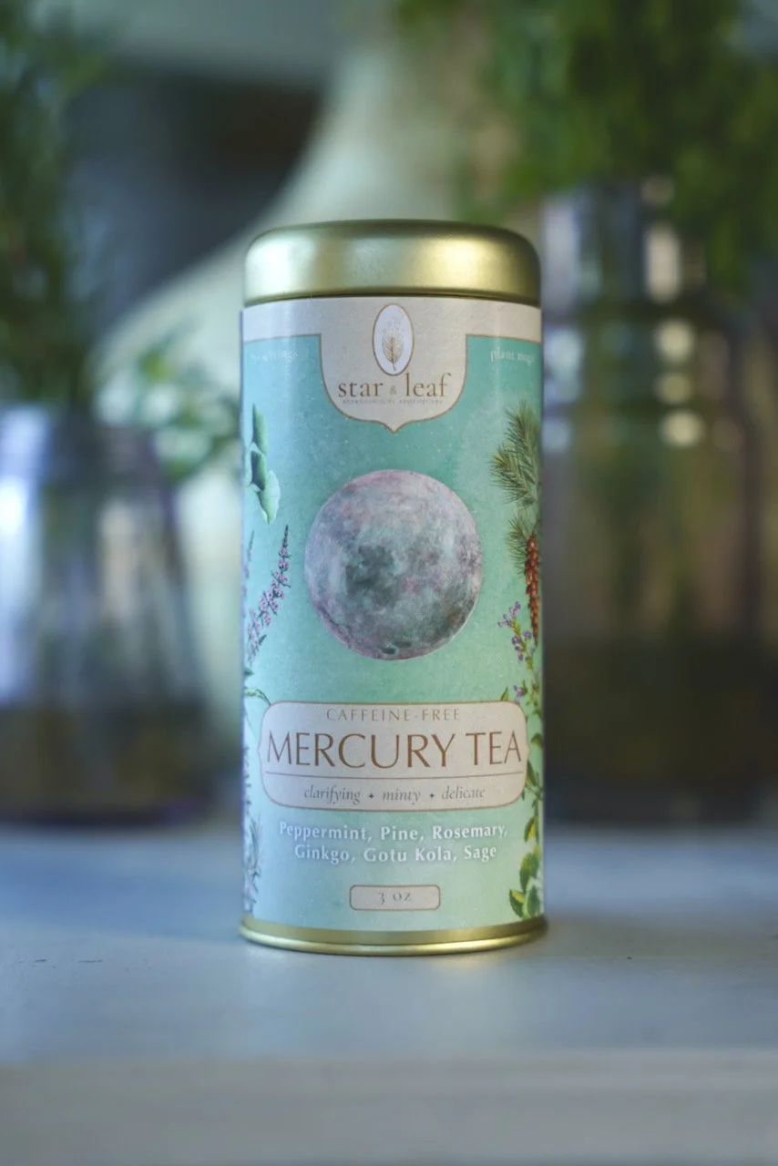
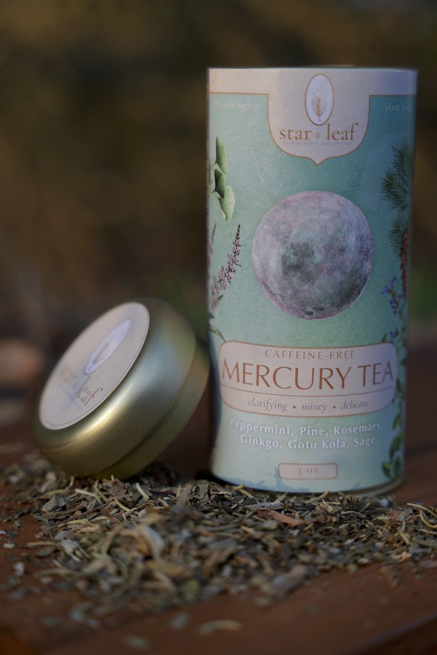
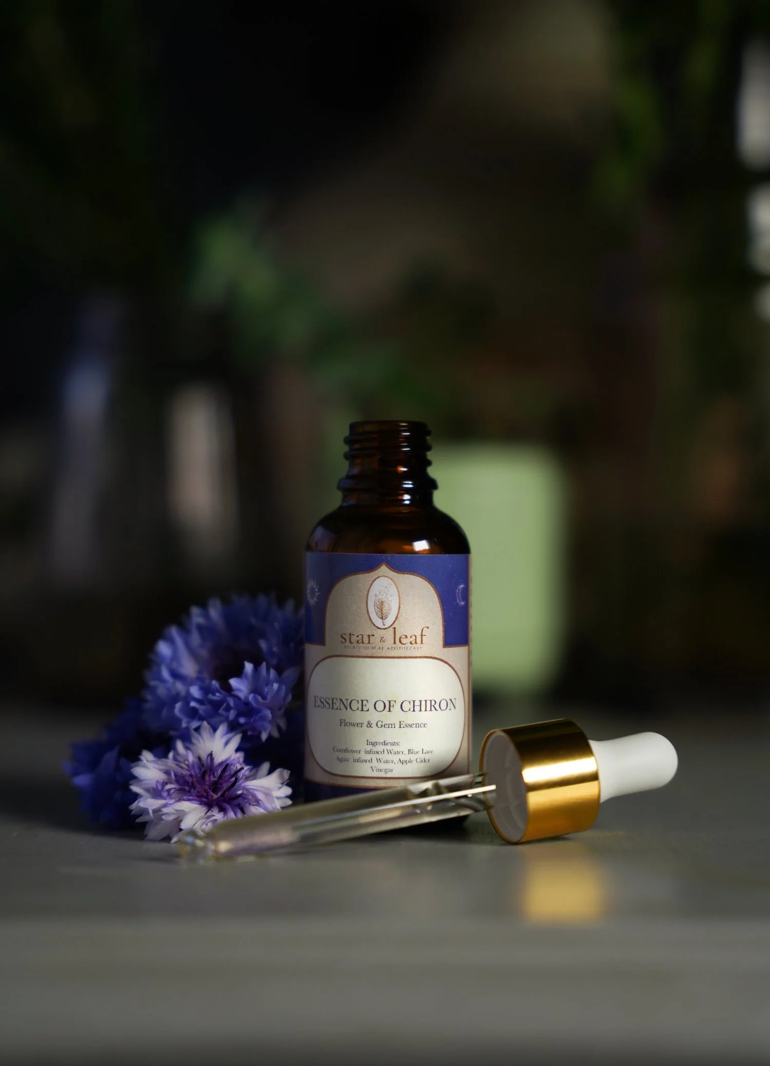
Star & Leaf is an apothecary that crafted organic teas and tinctures rooted in herbalism & astrology. I worked with the founder to establish a distinct textural brand that felt both grounded and ethereal. Everything from the hand-drawn logo to the use of archival botanical illustrations steep you in a vibrant, yet cozy universe of possibilities - somewhere between the earth and stars. Through a distinct process blending art & design, I created packaging that invites you into this world while clearly displaying key information.
BRANDING & LOGO
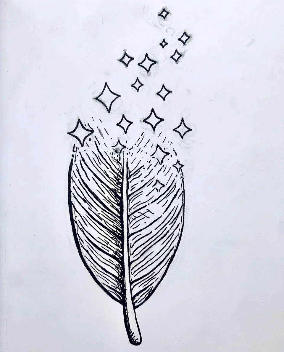
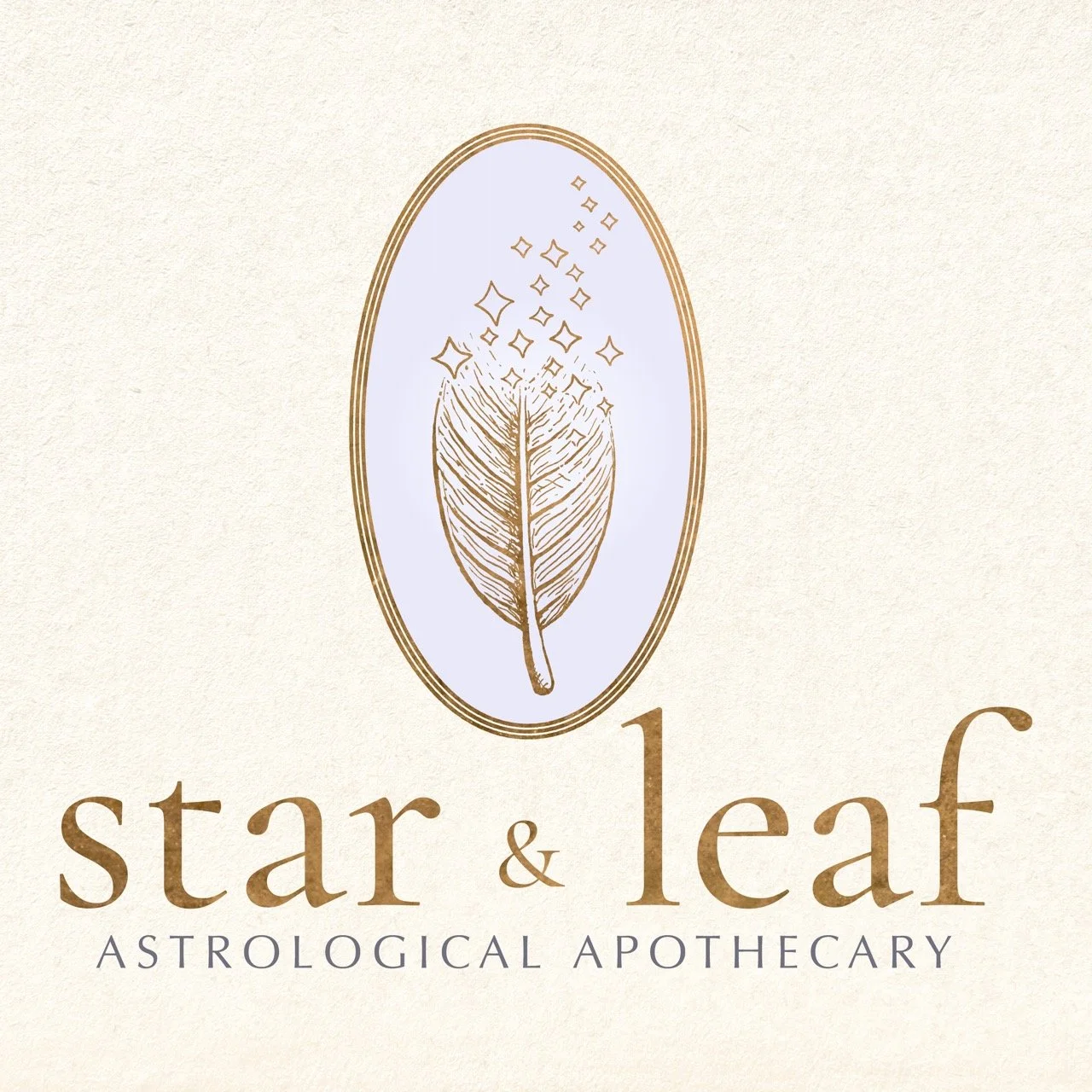
The name Star & Leaf embodies the heart of this brand. Star represents astrological forces and leaf represents herbalism. With this in mind, I knew this brand needed to feel both deeply celestial and human. Through a systematic discovery process with the company founder, we found the right look and feel for the logo: a completely hand-drawn image of a sage leaf dissolving into stars, framed by an apothecary-esque oval and lettering. After the seed of the brand was locked in, the right textures, fonts, and tone of the brand blossomed.
PACKAGING
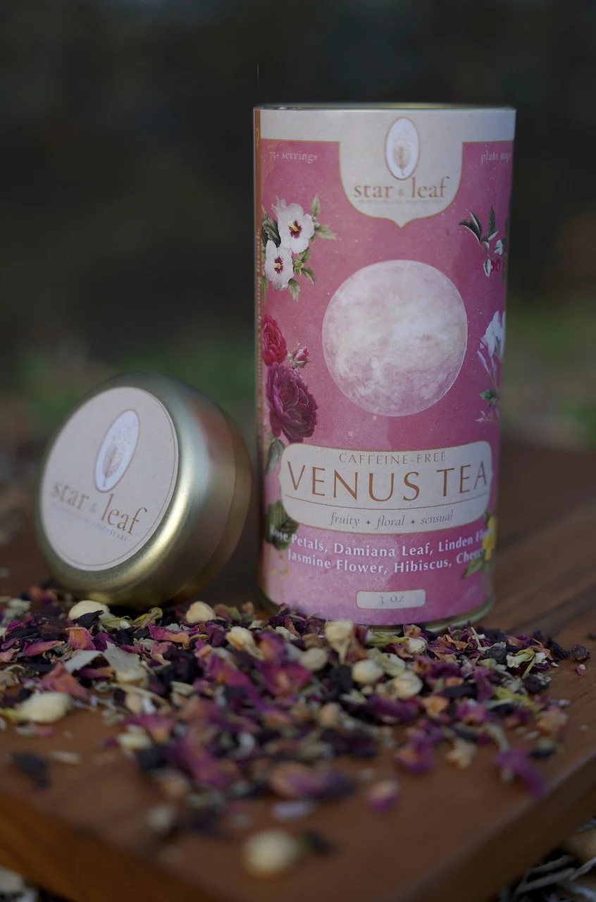
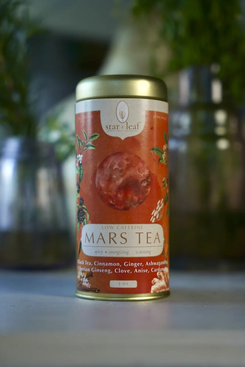
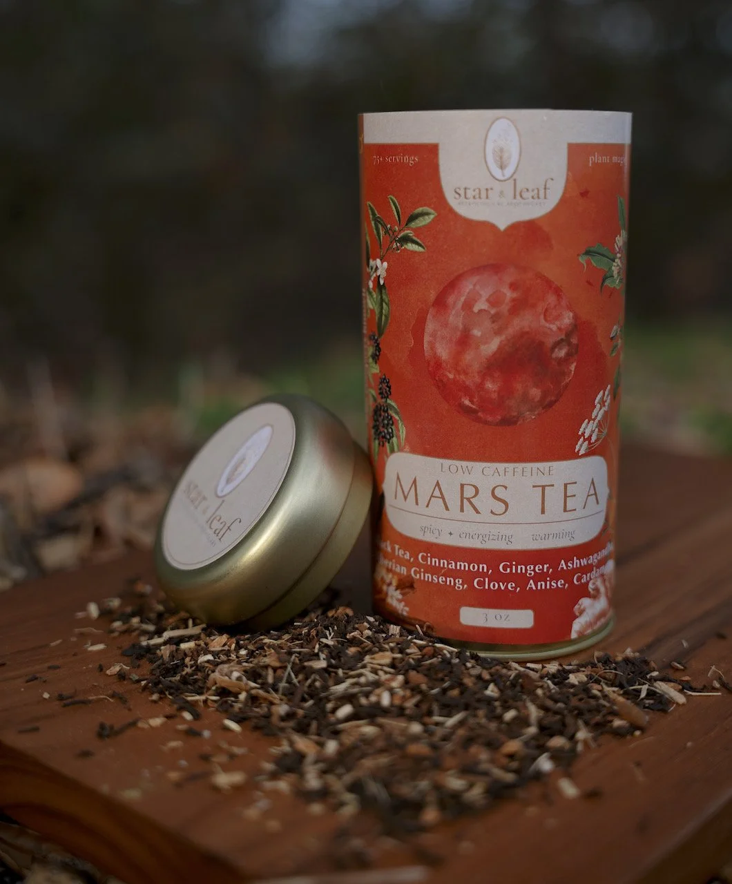
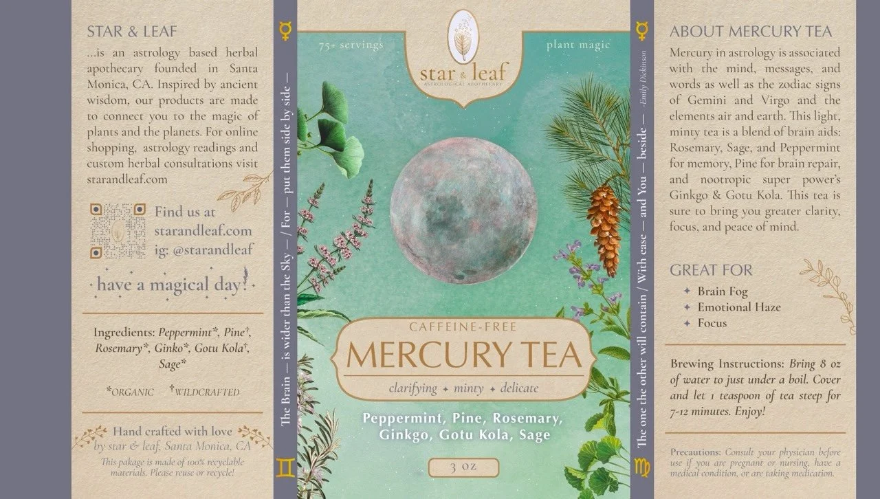
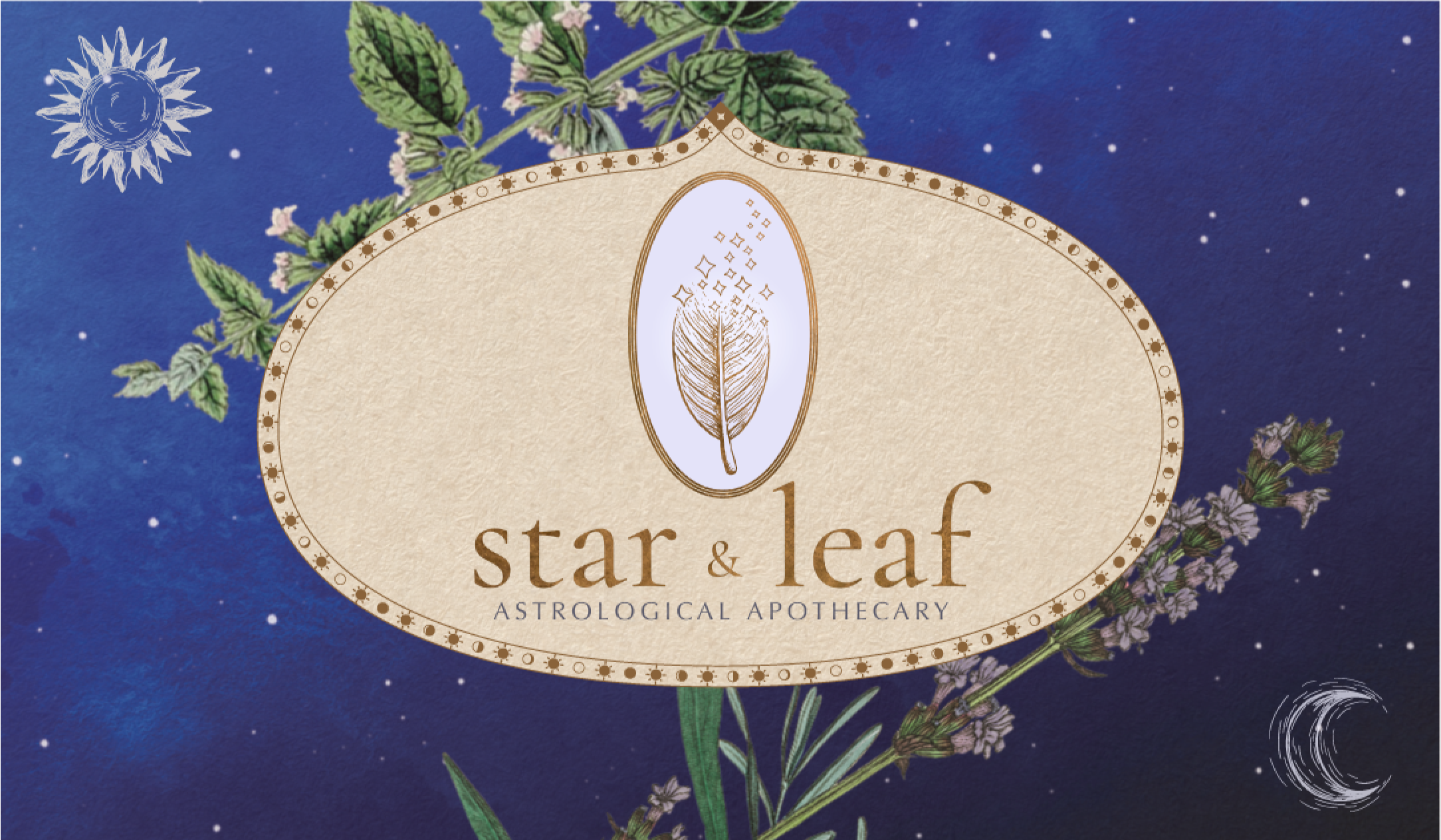
In the packaging, the Star & Leaf brand truly came to life. These teas & elixirs were truly extraordinary, and I knew that I needed to capture their magic in the packaging to do them justice. Through a discovery process, we found a unique way to juxtapose the celestial theme with hand-crafted elements. Antique drawings of herbs and watercolor washes of planets were cumbersomely assembled into cosmic compositions for the product packaging. Each label was crafted to be in harmony with one another, resulting in an inspiringly beautiful set of labels that captured the essence of each flavor, coming together as a truly unique aesthetic world.